
Talkiatry -
Rapid and practical brand expansion
Refining brand visual language, crafting expanded asset libraries, and leading art direction and project management of key brand moments
Role: Design Lead | Tenure: 4 years ongoing
Talkiatry is a national mental healthcare practice led by psychiatrists. Over four-plus years, my role has grown from Designer to Senior Designer to Design Lead.
From 2024 through 2025, our creative team refreshed Talkiatry’s brand with more streamlined, practical, and elevated visuals. This gave us more visual tools and greater flexibility as the company rapidly scaled to care for more patients, hire more doctors and clinicians, and support a wider variety of conditions and treatment approaches.

Updated illustration approach for greater flexibility
Previous iterations of our brand included a thematic and playful but limited illustration library. Moving forward, we needed a versatile base illustrative approach that could connect different elements of the visual brand more seamlessly and expand with the business.
Using what we called “pathway illustrations” as the baseline, these carry through many varied moments throughout our brand experience.
On the website as dynamic page dividers
As unifying background elements in our illustrated icon sets
As storytelling elements in our photography
To lead the eye and progress narrative in motion applications


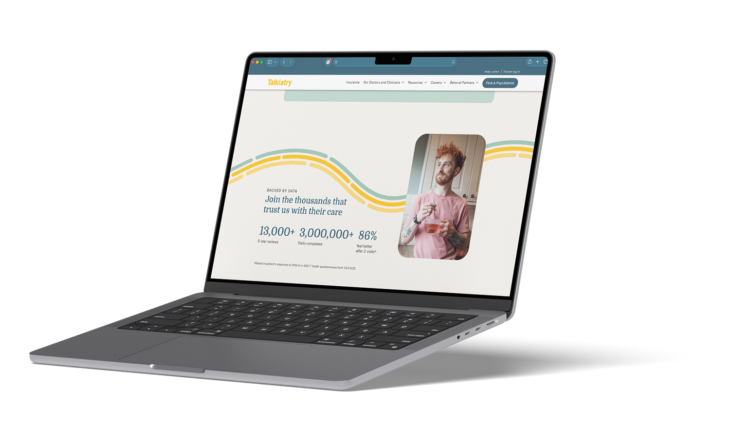


Photo illustration set


Illustrated icon set










A new logomark to bridge the gap
Talkiatry’s wordmark was doing a lot of heavy lifting as the brand’s only logo. There were improvised logomarks pulled from it: the “T” or the word-bubble tittle in the “i.”
As the company grew, a more elevated secondary mark was needed that clearly represented our brand in more compact and specific contexts. Most acutely, as an icon for our patient portal app.
After I developed and presented multiple rounds of iterations with stakeholders, we landed on a design that combined the “pathway” lines common in our brand language with the familiar word-bubble shape and a Talkiatry “T.”



Previous logomarks:


Elevation through simplification
Past brand expressions used a lot of color, energy, and activity towards the goal of feeling approachable, personable, and human.
In our brand expansion, we pulled back on color ratios to focus on three core brand colors, and reduced design elements. This still allowed for varied expression, but with more airiness and contrast that gives a better sense of expertise, authority, and trust.